Around two years ago, I decided to scrape the University of Victoria's course calendar website, obtaining descriptions and metadata for all courses offered at the time. I then represented this data as a graph in which each course is connected to all of its prerequisites and antirequisites1, and visualized the graph using one of the force-directed graph drawing algorithms2 provided in the software Gephi.
Here are the results3:
You appear to have JavaScript disabled. Click here to view the visualization directly in a new window. Alternately, if you enable JavaScript you will be able to pan and zoom in the above widget, and be able to click on any course to view the full course title.
Courses are coloured according to program. I tried to choose the colours so that no two programs near each other have a similar colour, but I wasn't always successful. The size of each node is based on a measure of centrality4.
Looking at large clusters of colours, we can see the relationships between different fields (e.g. computer science and software engineering are closely linked, as are engineering and physics, and math is right in the centre of everything).
We can also see some subdivisions within certain fields. For example, the GIS and remote sensing courses, which are part of the geography program, are nonetheless somewhat separate from the rest of the geography courses.
Finally, if we instead pay attention to colours that look out-of-place we can find the more "unexpected" crossovers, like LAW 328: Green Legal Theory and ES 312: Environmental Economics.
However, it's also interesting to note what's not visible in this graph. Specifically, most programs that are not STEM or STEM-adjacent are missing, This visualization shows the largest connected component in the pre/antirequisite graph, but the vast majority of courses outside of STEM and social science fields do not have any prerequisites or antirequisites at all, much less prerequisites that link them to this connected component5.
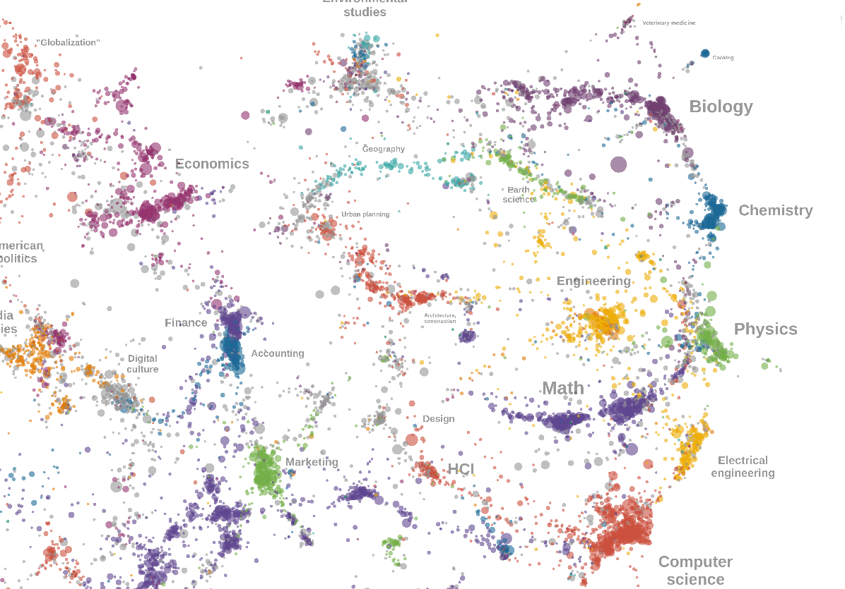
If you're interested in a more thorough and complete visualization of the links between academic subjects, check out the Open Syllabus "Co-assignment Galaxy" by David McLure and the Open Syllabus Project:

That project uses data from 6.9 million course syllabi and 2,521 different institutions to create a "co-assignment graph", in which the nodes are textbooks and two textbooks are linked by being assigned together in the same class. They then derive vector representations of each textbook from the co-assignment graph, and use UMAP to visualize the resulting vector space in two dimensions. The result is a "galaxy" of textbooks showing relationships between academic disciplines.
Another project with a similar goal is Paperscape, which maps out the relationships between different research areas by looking at citation data from arXiv, although this is restricted to the sorts of subjects that are represented on arXiv.
- Antirequisites are courses deemed so similar that credit cannot be granted for both. ↩
- Probably ForceAtlas2, but I don't remember anymore. ↩
- If the pan-and-zoom widget doesn't work on your device, you can instead view the SVG directly. ↩
- I can't remember exactly which measure of centrality I used. ↩
- The obvious exception is the theatre program, which is hanging on by a thread in this visualization. Otherwise, the only other noteworthy connected components in the prerequisite graph consist of classes involving a second language. ↩