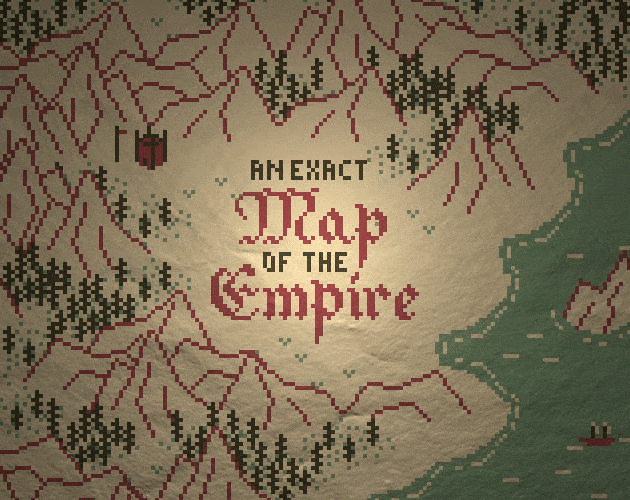
As someone with a formal background in math/CS, the biggest challenge for me in game dev has been art. Fortunately, I've kinda learned how to do pixel art in the past 4 years. Check out the cover art for my latest game, An Exact Map of the Empire:
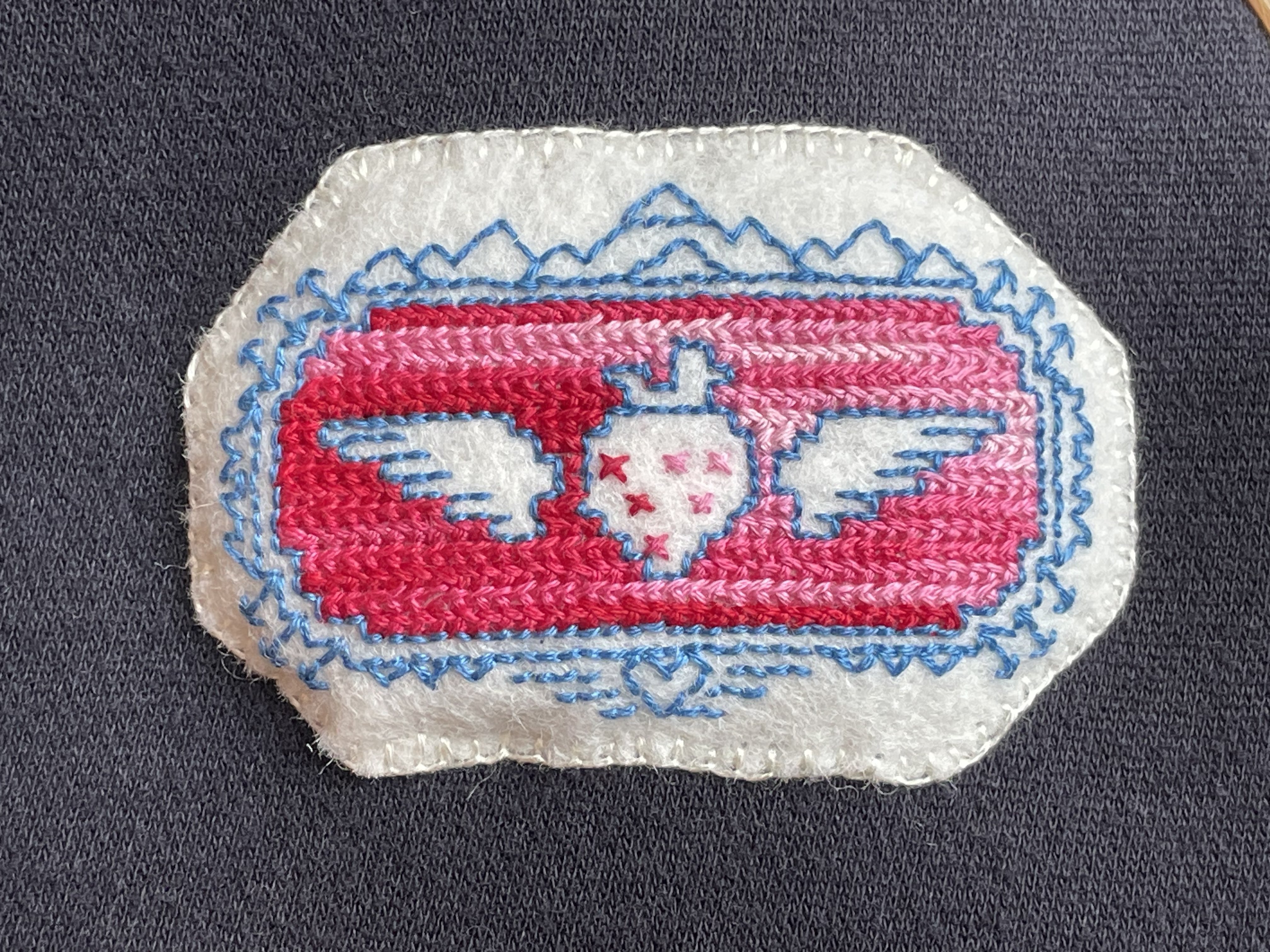
Pixel art also has an unexpected overlap with another hobby of mine that I haven't talked about yet on the blog: embroidery. Or maybe it's not so unexpected; the technical limitations of many mediums (early computing, counted cross stitch, weaving1, mosaic, etc.) often naturally lead to the same strategy of discretizing an image using a grid.
All this is to say that I feel like I now have some art tips that other people of a math-y/programming-y background might find useful. Here they are, roughly ordered from "concrete and immediately applicable" to "abstract general mindset tips."
Note, however, that I have no idea what I'm talking about and am absolutely still learning, so maybe some of this is wrong.
1. Use references!
This is probably extremely obvious to any artists reading this, but it was somehow non-obvious to me for a long time: You need to use reference images!
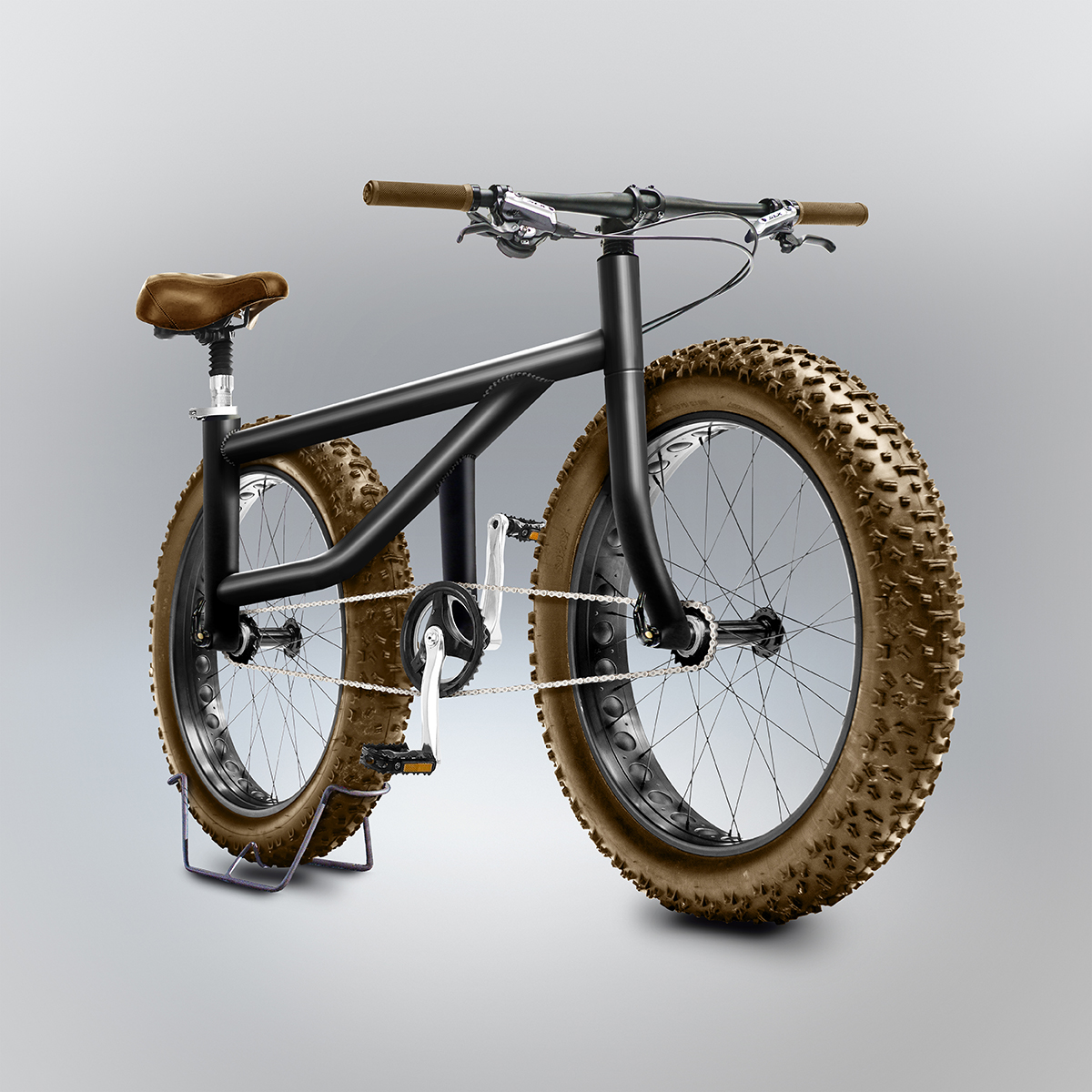
Suppose you want to draw a bicycle. Obviously the first requirement is to know what a bicycle looks like. Now, you might think "I already know what a bicycle looks like," but cognitive science says that you probably don't. If you don't believe me, check out Gianluca Gimini's Velocipedia, a collection of bike sketches drawn without reference & then rendered in realistic 3D2:
This is why the great renaissance artists famously studied anatomy and engineering and architecture and so on. If you want to draw a human or a building, you have to know what those things look like and what parts they have. Fortunately, nowadays we have image search, so you have no excuse to not look something up before trying to draw it.
Keep in mind that when I say "looks like," I mean understanding what shape the object is in a three-dimensional sense. The point is not to copy the two-dimensional image!
"But Avery," you might be thinking, "does this apply even to low-resolution pixel art?" Yes! Why wouldn't it? If anything, it's even more important to get the basic shapes right in low-rez pixel art because all your other visual channels of communication (colour, texture, etc.) are severely limited (with one exception, which we'll get to later).
2. Pick a colour palette!
Every art program has a little colour picker in it, where you can pick any colour you want out of the approximately 16 million colours capable of being represented by a computer. Like dinosaur fossils, this is a trap created by the devil to deceive you.
Using a limited colour palette is extremely powerful, for several reasons:
- If all the art in your game is drawn from the same palette, it helps create "unity of effect" and a sense of coherent artistic direction.
- If you're using a well-designed colour palette, then basically any choice of colours from it should go fairly well together, without you personally needing to know anything about colour theory.
- More generally, having a restricted set of colours to pick from helps reduce the cognitive load involved in picking which colour to use at any given time.
You don't have to design the colour palette yourself; one great resource is the list of palettes at lospec.com. Just browsing the examples there should give a strong sense of how much the palette affects the overall mood/vibes of an image.
If you instead want to create something novel, there are lots of tools that will try to extract a usable palette from a photo of your choice; for example, Adobe Color or coolors. However, be warned that most of these tools are primarily intended for visual design (branding, UI, etc.), so the types of palettes they produce don't necessarily have the more artist-friendly properties (e.g. colour ramps) that the nice palettes on lospec have.
Finally, you could of course learn colour theory, a fascinating topic with hidden depths that scare me. Maybe start with this Acerola video, or this fascinating talk on designing a colour map for matplotlib, or this eldritch tome of forbidden lore. Colour theory touches on basically every domain of knowledge: physics, biology, math, philosophy, cognitive science, art, you name it!
3. Use animation as much as possible!
One advantage that low-resolution digital pixel art has over other mediums is that it's extremely easy to animate. And animation is an extremely powerful tool. For one, moving images are simply more visually interesting and attention-grabbing that static ones. But more importantly, motion offers a very high-bandwidth visual channel for communicating additional information, which is important when other visual channels (like color and shape) are restricted due to using a limited palette and low resolution.
To demonstrate what I mean, consider this scene from my game The Restricted Archive:
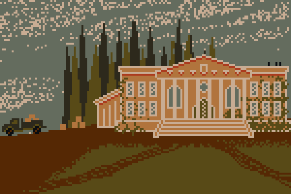
Look at the crows on the roof of the building. They're literally just two-pixel tall black rectangles, but because of the way they move you can kinda identify them as birds3.
If you check out some games made using Bitsy you'll find that Bitsy's draconian restrictions on resolution and colour often make static single-tile sprites very difficult to interpret, but the addition of simple 2-frame animations does a ton to improve legibility.
4. "Art Fundamentals" is kinda the same thing as "Computer Graphics"
What are the steps of creating a computer-generated image?
- Creating a 3D model of the object to be displayed.
- Projecting the 3D geometry of the object into 2 dimensions.
- Considering the position of the light source(s), orientation of surfaces, texture of the surfaces, etc. in order to place appropriate shading, cast shadows, specular reflections, and so on.
The thing is, this is also the workflow of a classically trained human artist. They even call the last step "rendering," same as we do in CGI.
Take the popular Drawabox tutorial series as a (somewhat opinionated) example. In it you'll find lessons on decomposing an object into comprehensible three-dimensional shapes, lessons on projecting those shapes to two dimensions with perspective, lessons on texturing the surfaces, shading4, and so on.
I point this out because someone of a more math/CS-ish persuasion might find learning resources about computer graphics to be more approachable & intuitive than artistic resources describing essentially the same concepts. This is because many of these ideas are easily described in mathematical terms5. Unfortunately, while math is a very powerful tool for abstract reasoning, our culture often maligns it and portrays it as intimidating, rigid, inscrutable, and in opposition to creativity & intuition. As a result, lots of mainstream art resources actively avoid the math that, for a certain kind of person, actually makes things simpler to express and understand.
More generally, computer graphics encourages a methodical way of thinking about art, which leads into my final piece of advice.
5. Art is just like software development
By which I basically just mean "be methodical, don't yolo it."
Some people try to approach art in a very unstructured, intuitive manner. They just sit down in front of a blank screen and "try to draw something," and then when it turns out badly they think "whelp, I guess I just don't have artistic talent."
This is silly. Think about how you would develop a piece of software. You take the task you're trying to accomplish, break it down into sub-tasks, and then break those down further until you're left with simple tasks that you know how to achieve in code, which you can then assemble into a whole. When faced with multiple ways to do something, you use your goals and priorities to decide on the best approach.
Art is the same way. Say you want to draw a forest. You're not just gonna be drawing "a forest," you're going to be drawing some sort of landform, and trees, and undergrowth, and then applying lighting to it and so on. So you have to ask yourself questions about the individual components. Questions like:
- What is the basic geography here like? Hilly or flat?
- What kind of trees are there?
- What does that kind of tree look like?
- What 3D shapes make it up?
- What do those shapes look like when projected to 2D?
- What is the 3D texture of the bark?
- How far apart should the trees be?
- What does that kind of tree look like?
- What other plants might be present in the undergrowth?
- What do those plants look like, etc...
- What's the lighting like?
- What time of day is it/where's the sun located?
- What's the weather currently?
Of course, this is complicated by the fact that the forest does not actually exist, so you need to make decisions about all of these things (e.g. what time of day should it be?). Fortunately, art, like engineering, has goals to help guide your decisions. Goals like:
- What plot-relevant information am I trying to convey?
- at a minimum, presumably you want the viewer to recognize this scene as a forest
- maybe it's supposed to be a forest in a specific geographic region?
- How do I want the player to feel?
- is this a spooky forest or a cozy forest?
- What are the themes of the work as a whole?
- do you want to suggest that the forest is threatened by human actions, or that humans are ultimately powerless in the face of nature?
These goals help answer the previous questions. Plot-relevant location information determines the type of tree, undergrowth, et cetera. Mood helps determine what sort of lighting you want. Themes help you determine what else to put in the scene (Ancient ruins to imply the dominance of nature? Stumps or pollution to suggest the threat posed by humans?).
The point is: break down the task and approach it methodically, like you would an engineering problem. Don't just "go for it."
This may seem like a lot of work. And it is! But presumably with practice you develop meaningful intuition for individual steps of this process. Experienced artists can sit down and sketch something without necessarily being as explicit about all of these things, but that's just because they've learned appropriate shortcuts, similar to the "mathematical maturity" that allows you to approach math less rigorously only after you've already learned how to approach it rigorously.
Summary/TL;DR
I offer 3 concrete, immediately applicable lifehacks:
- Use reference images!
- Pick a colour palette (probably from lospec.com)
- Use animation extensively (specifically to improve the legibility of low-resolution pixel art)
In addition, I have two broader mindset tips:
- Learning computer graphics helps with art fundamentals
- Approach art by methodically decomposing the problem, just as you would approach software development
I hope this helps!
- Famously, the earliest use of punch cards for programming was the programmable Jacquard loom. ↩
- Copyright Gianluca Gimini, used under the CC BY-NC-ND 4.0 license ↩
- Not to toot my own horn too much, but here's video evidence of a streamer appreciating my tiny crows! ↩
- Although Drawabox idiosyncratically de-emphasizes shading for opinionated pedagogical reasons ↩
- For instance, the simple rule of diffuse shading is that the lightness of a surface is proportional to the dot product between the surface normal and the light direction vector. ↩